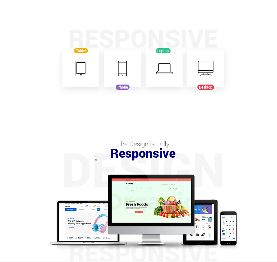
In today’s digital world, responsive design is no longer just a nice-to-have—it’s essential. Here’s why responsive design is critical and how it impacts your website’s success:
- Improved User Experience
Responsive design ensures that your website looks and functions well on any device, whether it’s a desktop, tablet, or smartphone. This adaptability leads to a smoother, more enjoyable user experience. - Higher Search Engine Rankings
Search engines like Google prioritize mobile-friendly websites in their rankings. A responsive design improves your chances of ranking higher in search results, driving more organic traffic to your site. - Increased Conversion Rates
If your site isn’t optimized for mobile, you risk losing potential customers who find it difficult to navigate or complete transactions on their devices. Responsive design ensures a seamless experience, leading to higher conversion rates. - Lower Bounce Rates
A non-responsive site can lead to higher bounce rates as users leave your site due to poor usability. A responsive design keeps visitors engaged, reducing bounce rates and encouraging longer visits. - Future-Proofing Your Site
Technology is constantly evolving, and new devices with varying screen sizes are introduced regularly. Responsive design ensures your website remains compatible with any future developments.